Ormorphia
Ormorphia is a lab-grown diamond brand at an interesting intersection: a genuinely luxury product, but a category that's still building consumer trust and cultural credibility. The design challenge wasn't just aesthetic, it was strategic. How do you signal premium without relying on legacy luxury codes? How do you make a new category feel inevitable?
The brief called for "refined but approachable" — which is a tension, not a direction. My first move was to resolve it: refined in structure and restraint, approachable in warmth and pacing. No cold minimalism. No maximalist luxury theater. Instead: generous whitespace, editorial hierarchy, and a visual language that trusts the product.
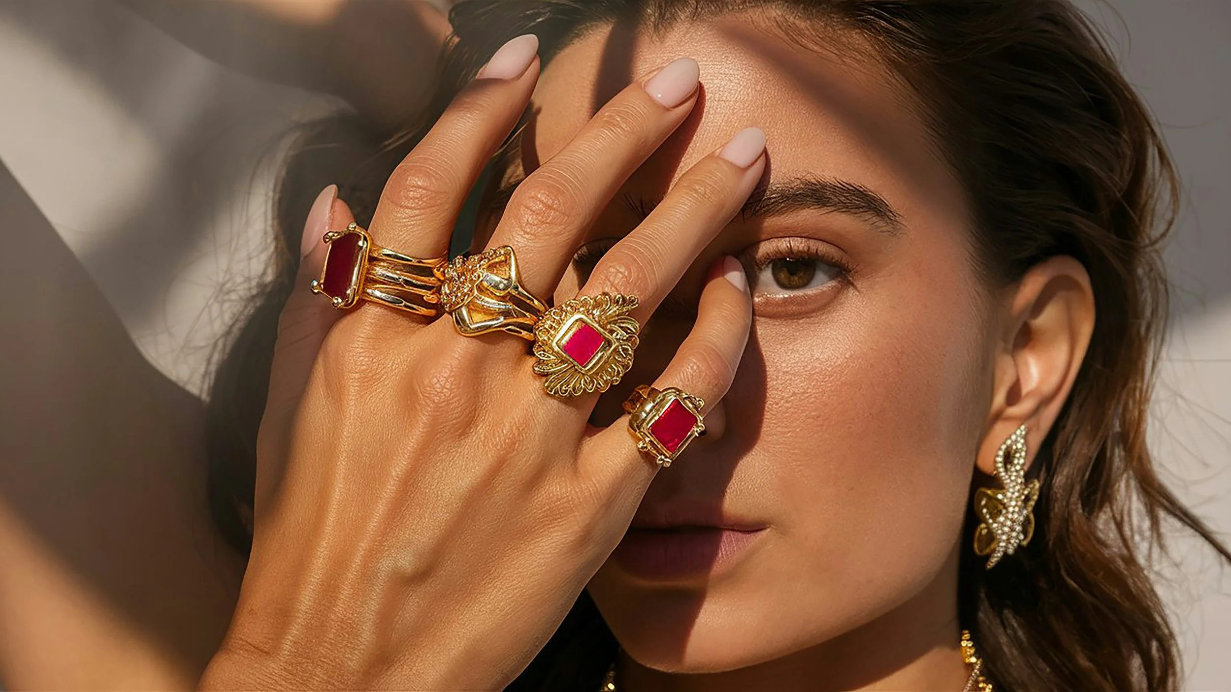
Art direction was a significant part of this engagement. I defined the photography direction — lighting mood, styling logic, contextual framing — to ensure that any future product photography would reinforce rather than undermine the experience.
-
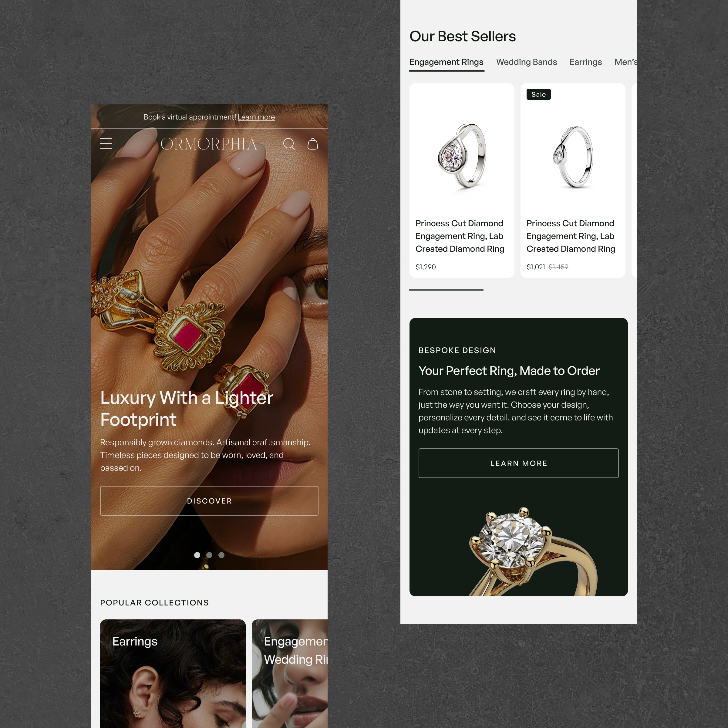
![Mobile Homepage]()
Homepage
Entry point designed to establish brand world before pushing product — trust before transaction.
-
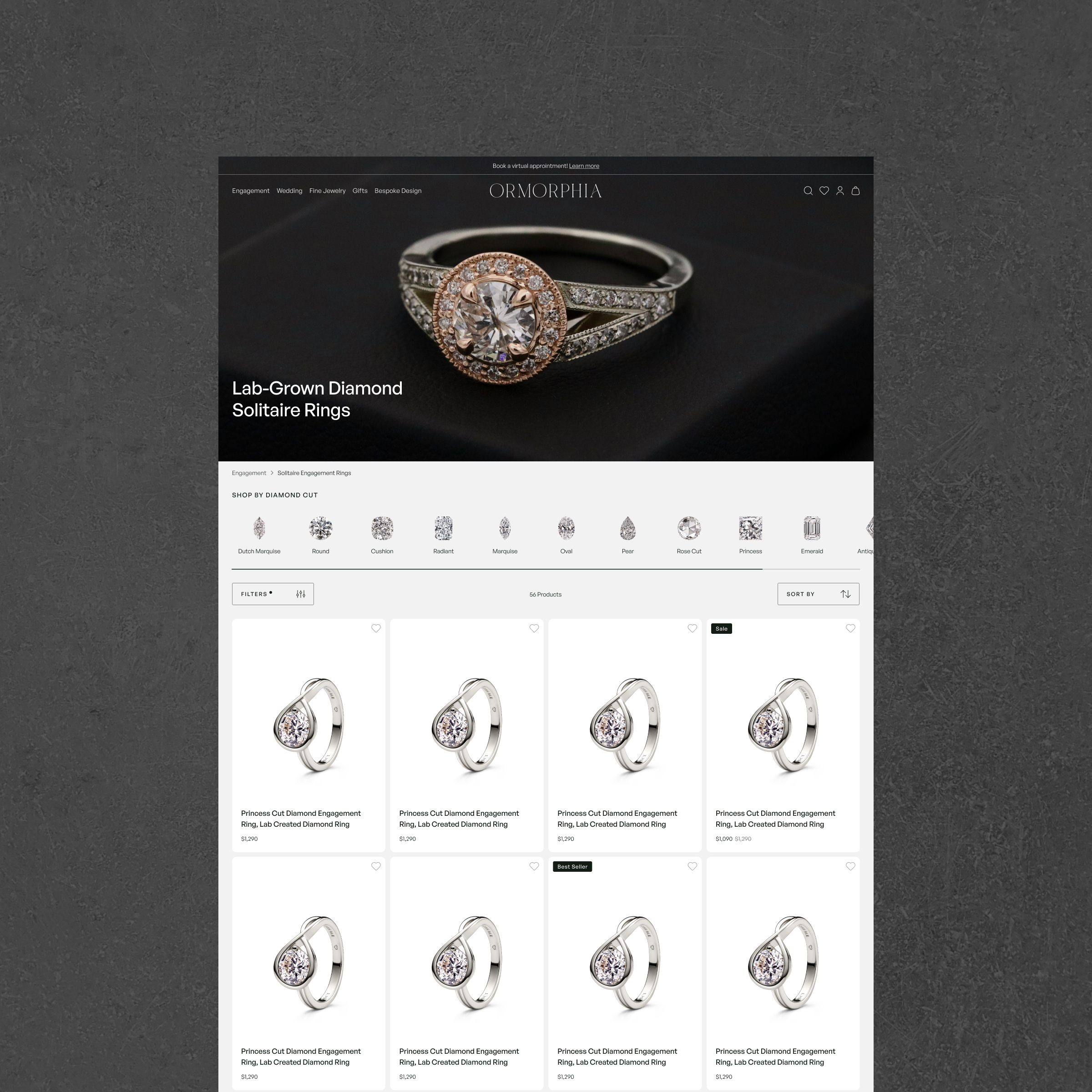
![Product Listing Page]()
Product Listing Page
Filtering and hierarchy structured to support discovery without overwhelming a curated catalog.
-
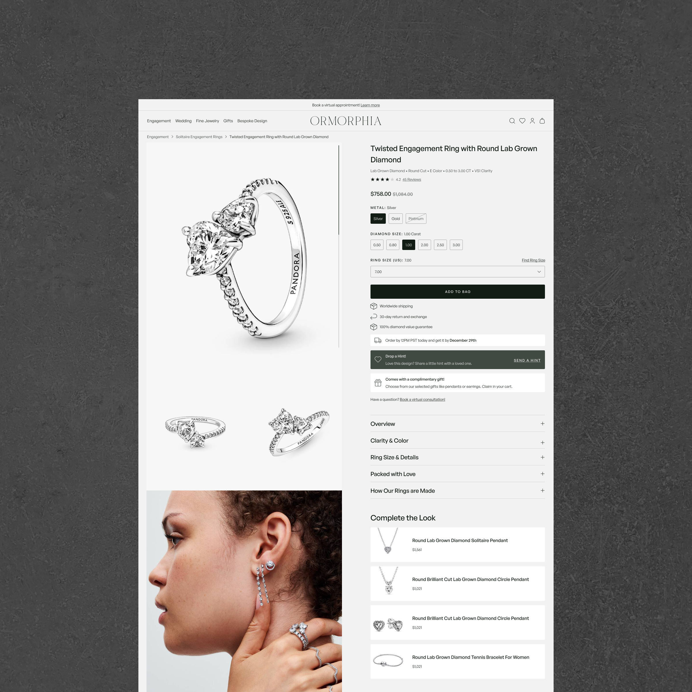
![Product Page]()
Product Page
Conversion architecture that balances product detail, emotional resonance, and purchase confidence.